Using the Graphing page
Currently, the program will provide graphs for moderation analyses only. Three moderation
analyses are supported. For the case with one moderator, a simple slopes and/or
a confidence interval graph may be requested. For the other two cases, three of
each graph will be produced.
Note that if a model contains interaction terms but no focal and moderator variables are selected on
the Settings page, the Graphing page will not be available.
For more on these graphs, please use the links below:
Types of moderation
Case 1: One moderator
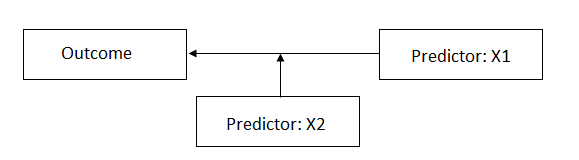 In Case 1, the predictor or moderator variable X2 moderates the relationship between the focal
variable X1 and the outcome. This corresponds to the equation
In Case 1, the predictor or moderator variable X2 moderates the relationship between the focal
variable X1 and the outcome. This corresponds to the equation
 For Case 1, one simple slopes and one confidence interval
graph may be requested.
For Case 1, one simple slopes and one confidence interval
graph may be requested.
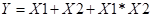
Case 2: Two independent moderators
Consider the case
where the relationship between the outcome and a predictor (denoted as X3 in the
image below) is moderated by two predictors (X1 and X2). While it is assumed
that these two variables moderate the relationship, they are independent of
each other.
 This corresponds to the equation
 For Case 2, three simple slopes and three confidence
interval graphs will be produced.
For Case 2, three simple slopes and three confidence
interval graphs will be produced.
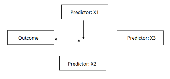
Case 3: Two dependent moderators
In this case, there
are again two predictors moderating the relationship between the outcome and a
focal predictor (denoted as X3) in the image below. However, in contrast with
Case 2, where two independent moderators are present, here the two moderators X1
and X2 are dependent.
 This corresponds to the equation
 For Case 2, three simple slopes and three confidence
interval graphs will be produced.
For Case 2, three simple slopes and three confidence
interval graphs will be produced.
Description of graphs
The first of the available graphs is a plot of the conditional regression line(s) describing the relationship between the outcome and the focal predictor as a function of the moderator. The plot will automatically show a line at each of three values of the moderator variable: mean – 1 standard deviation, mean, and mean + 1 standard deviation. In other words, the value of the moderator variable is held constant at three specific values. Values of the focal variable are used to define the x-axis, and the plot is confined to the area (mean of focal variable – 2 standard deviations, mean of focal variable + 2 standard deviations).
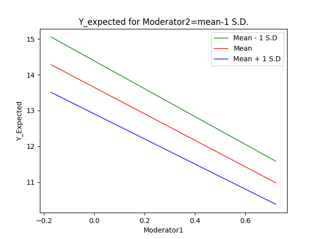 The plot is produced
as a *.png file with the name <syntax file
name>_simple_slopes.png which can easily be inserted into a paper. A
number of plot settings may also be modified by the user
on the Graphing page within the program.
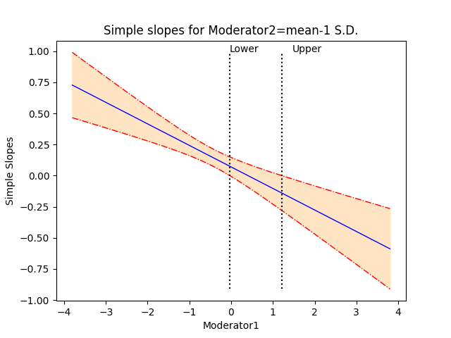
The second plot
shows the regression line describing the relationship between the outcome and
the focal predictor as a function of the moderator, along with a 95% confidence
interval. It also shows the so-called region of significance, provided that the
boundaries of this region falls within the scale set
by the values of the moderator variable, which again defines the x-axis. The
region between the lower and upper bound of the region of significance
indicates the values of the moderator for which the slope of the regression of
outcome on focal variable transitions from non-significance to significance.
An example of the confidence interval
plot with regions of significance is shown below. The plot produced by the
program is saved to a *.png file with the name <syntax
file name>_confidence_interval.png.
The plot is produced
as a *.png file with the name <syntax file
name>_simple_slopes.png which can easily be inserted into a paper. A
number of plot settings may also be modified by the user
on the Graphing page within the program.
The second plot
shows the regression line describing the relationship between the outcome and
the focal predictor as a function of the moderator, along with a 95% confidence
interval. It also shows the so-called region of significance, provided that the
boundaries of this region falls within the scale set
by the values of the moderator variable, which again defines the x-axis. The
region between the lower and upper bound of the region of significance
indicates the values of the moderator for which the slope of the regression of
outcome on focal variable transitions from non-significance to significance.
An example of the confidence interval
plot with regions of significance is shown below. The plot produced by the
program is saved to a *.png file with the name <syntax
file name>_confidence_interval.png.
Changing graph parameters
Graphs can be
modified using the Graphing page. This page is only available for moderation
analyses. When this page is first opened, all options are set to default
values. By default, both a simple slopes and a confidence interval graph will
be produced.
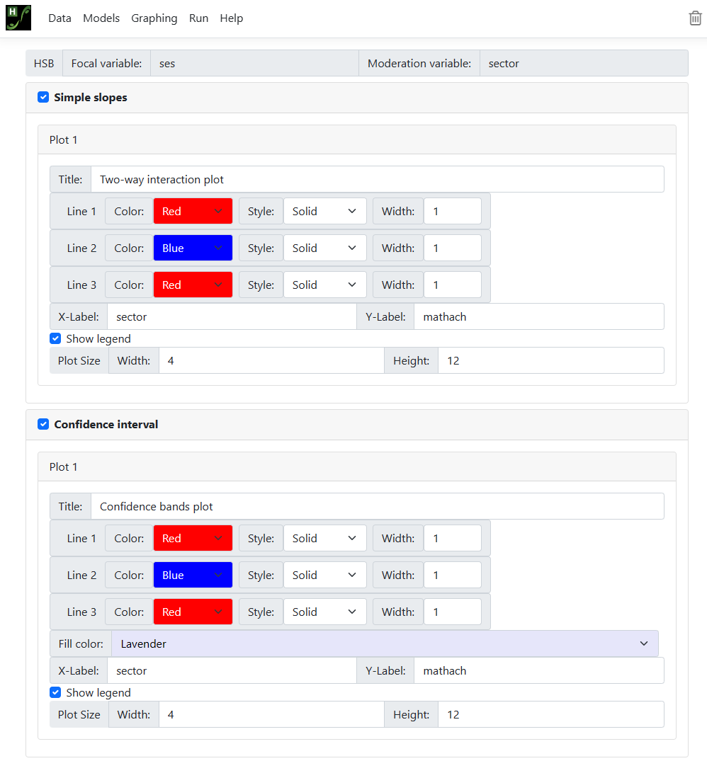 All options are
activated and may be changed. The image below shows a modified selection,
requesting black and white graphs. For moderation model 1, there will only be
one simple slopes graph and/or one confidence interval graph; for models 2 and
3 there will be three of each. In all cases, however, the following options
apply:
All options are
activated and may be changed. The image below shows a modified selection,
requesting black and white graphs. For moderation model 1, there will only be
one simple slopes graph and/or one confidence interval graph; for models 2 and
3 there will be three of each. In all cases, however, the following options
apply:
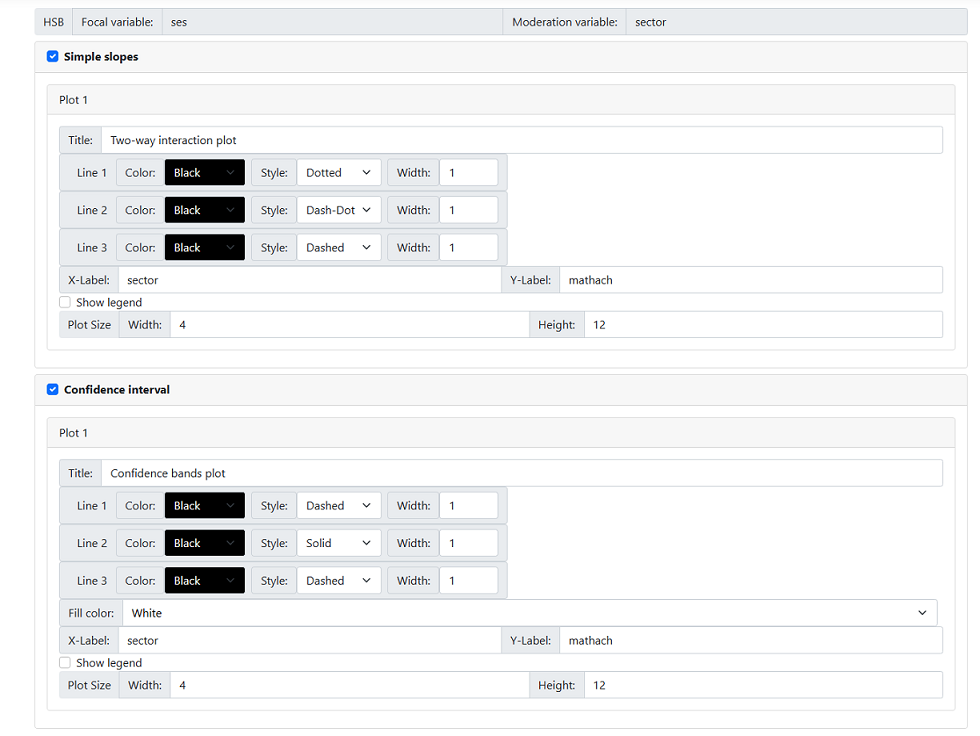
-
The default title is displayed in the Title field and may be changed according to user preferences.
-
Line color, style, and width: one of eight colors may be selected using one of four styles
and in three widths.
-
X-label and Y-label: By default, variable names appear as axes labels. This too can be changed by the user.
-
In the case of a simple slopes graphs, the user can show the legend (default) or opt to suppress it by unchecking the
check box next to this option.
-
The plot size may also be changed, but readers should note that the default settings work well for most
cases.